
Shrink empty daily notes in the past
complete
p
philfreo
Having a nearly-full-screen area to takes notes for today's notes (or any date, if I'm typing on it) is very nice, I like them big.
However a common scenario for me to want to scroll through and "catch up" on recent past notes. This becomes problematic especially if I had a long weekend or vacation since it results in having to do lots of "scrolling through" all the empty or mostly-whitespace days to just review the latest days with notes.
Assumptions / goals:
- When taking notes on a day, you do want to have a lot of vertical padding / whitespace to give you some breathing room and help you focus on today.
- When scrolling through other days, you're in "reading mode" and excess whitespace doesn't help.
Suggestion:
- For the Daily Note that has an active cursor/focus, keep it's minimum height as big as the empty note current size (or even larger).
- For any Daily Note without focus (or at least the ones in the past), the minimum height should be much smaller, because there's no need for so much padding when scrolling through past days (in "reading mode").
- When you start typing on a daily note (alternatively: as soon as it's focused), do a quick transition to increase its minimum height it's not already at the larger size.
This would result in:
- The experience would be the same as it is already when viewing today or any Daily Note day you're actively taking notes on.
- The experience would also be the same as it is already when scrolling through past Daily Notes with long notes.
- For very short non-focused Daily Notes notes (1-2 bullets) this would reduce the amount of whitespace between notes, to match the amount of whitespace between long notes. Right now it's inconsistent how much whitespace is in between short vs long notes on past days.
- For empty non-focused Daily Notes, it would also shrink them a lot, leaving enough so that you can see there's an empty day and allow you to select/focus it to start typing.

Alex MacCaw
complete
Released! :)
p
philfreo
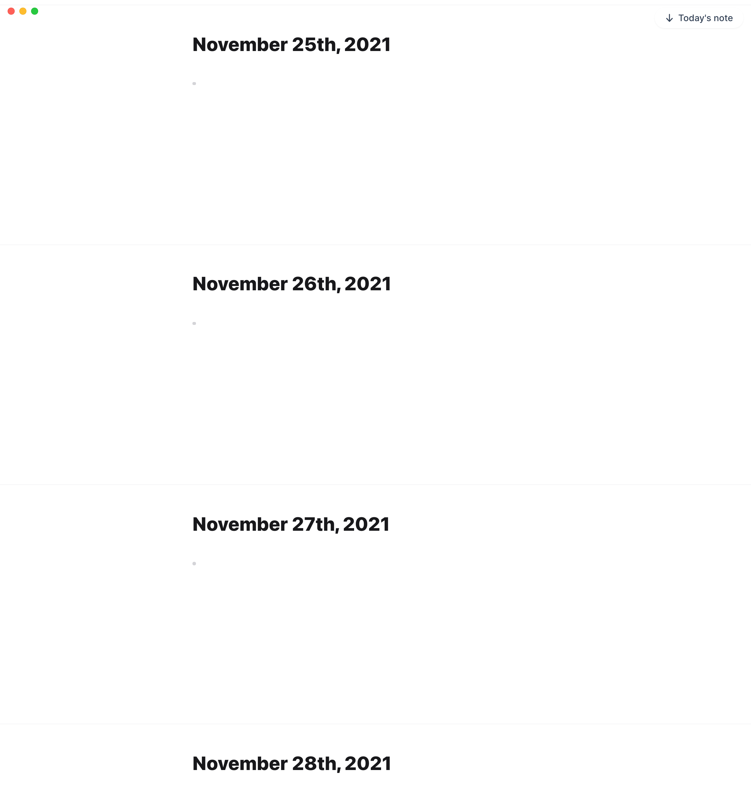
Alex MacCaw: Is it already live? I've refreshed/restarted Reflect and am not noticing major improvements here. For example if I scroll back to view notes before & after Thanksgiving weekend I have a full big monitor's height worth of empty daily notes.
My hope was that this would be collapsed to almost nothing and you could easily scroll past weekends/vacations without so much space to just focus on the days with notes.
Alex MacCaw
philfreo: I see what's going on - we're using a relative min-height (vh) vs an absolute one. Will fix.
Alex MacCaw
planned